BRANDING
This project aimed to revive and promote the ancient craft of Aranmula Kannadi from Kerala. The objective was to prevent its decline by establishing a strong brand presence both within and outside Kerala and India. The project included creating logo, typefaces, taglines, color schemes, visual language and digital media collateral like visiting cards, banners and packaging, including gift packaging. Comprehensive brand guidelines were developed to maintain consistency and effectively convey the brand's essence. This branding project played a crucial role in preserving and revitalizing Aranmula Kannadi, ensuring its recognition and longevity.

Aranmula Kannadi, meaning 'six bamboo stems mirror' in Malayalam, is a glassless metallic mirror that forms a significant part of Kerala's rich cultural craft. It is made using a secret formula known only to the Aranmula family, combining ingredients such as silver, bronze, copper and tin to achieve a distortion free reflection. This unique mirror, made without mercury, is not only long lasting but also believed to bring good luck and prosperity to its users. It received a GI tag in 2004 - 2005 and holds a revered position as one of the eight auspicious articles in Hindu customs ( ashtamangalyam ). Foreigners are often captivated by this exquisite craft, but it faces the risk of endangerment due to various factors.
MIRROR AESTHETIC


KEYWORDS
BRAND VALUES

BRAND VOICE
BRAND TONE OF VOICE


BRAND PERSONALITY
BRAND ARCHETYPE


LOGO - TYPEFACE - TAGLINE
The logo is derived from the form of the actual mirror, then being repeated to form a circular motif. The thick and thin lines in the logo emphasis on the elegance of the logo and the circularity was imparted as a relation to the circular shape of the mirror.
The same matter of elegance is applied while choosing the typeface for the logo with the thick and thin line font called Quinshy.
The whole logo and typeface is supported by a tagline which brings in the authenticity of the craft into the logo.
COLOR PALATTE
Even while choosing the color schemes for the logo, the brand's luxurious and cultural voice plus the traditional gentle personality was maintained.
PRIMARY COLORS
SECONDARY COLORS


VISUAL LANGUAGE - PATTERNS


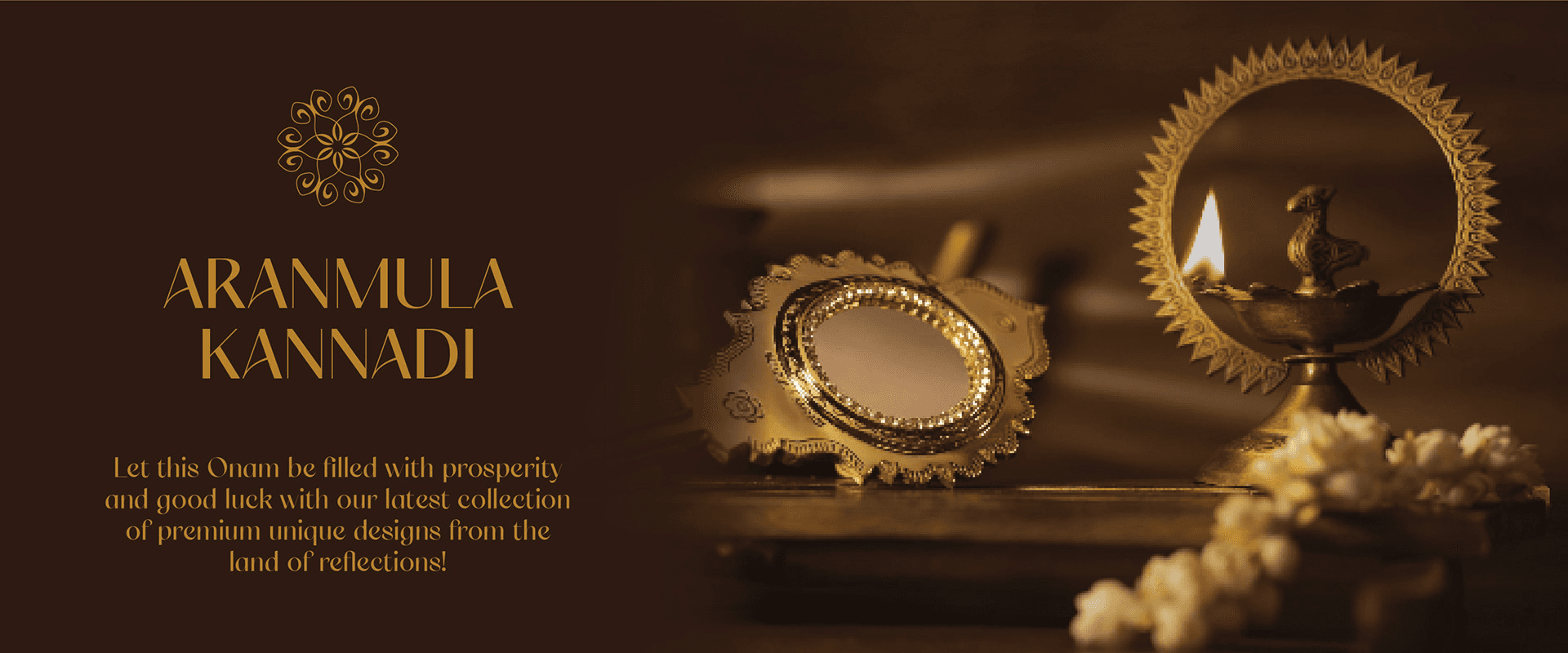
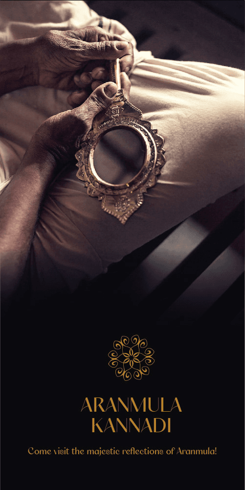
BANNERS

VISITING CARDS


BRAND GUIDELINES


The photographs of the mirror used in the project was not taken by me.
The source to the imageries are:
https://www.madhumitanandi.com/aranmulakannadi
https://sheshaayurveda.com/product/aranmula-mirror/
Thanks for coming all the way here. Let’s create something amazing together!
Feel free to reach out!